
If you’re anything like us, the Pantone Institute’s announcement of the 2026 color palette is pure color inspiration. Alongside the excitement of New York Fashion Week, it brings bold new energy to the world of interior design. This palette sparks creativity and ideas that can transform old and new spaces. It’s sophisticated and romantic fused together to evoke emotional intensity.
The Palette
Laurie Pressman, of the Pantone Color Institute, believes the colors that were selected give the opportunity to seek out…
“Freedom to redefine color usage, this season’s palette contrasts warm familiar shades with more vibrant, stimulating colors and foundational tones.”
In the past, there was a heavy concentration on blues, greens, and yellows. The exciting aspect of the new range of colors are heavy in reds, pinks, and purples giving a change for the non traditional to stand out.
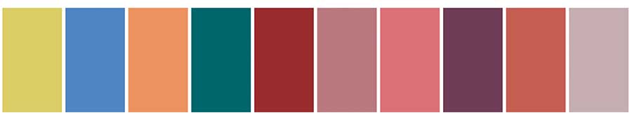
To complement the main color palette there is another group of hues selected. This is commonly referred to as the neutral palette. Although they are typically more foundational colors there can occasionally be a statement color.

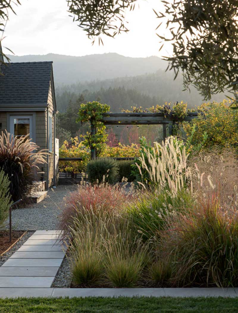
Color Inspiration from Nature
We always say the best color inspiration comes from the outdoors. The lush vegetation and ample textures are soft but always with dimension. This landscape show this year’s color palette in real time. Time to explore and see how they’re being used in home design.
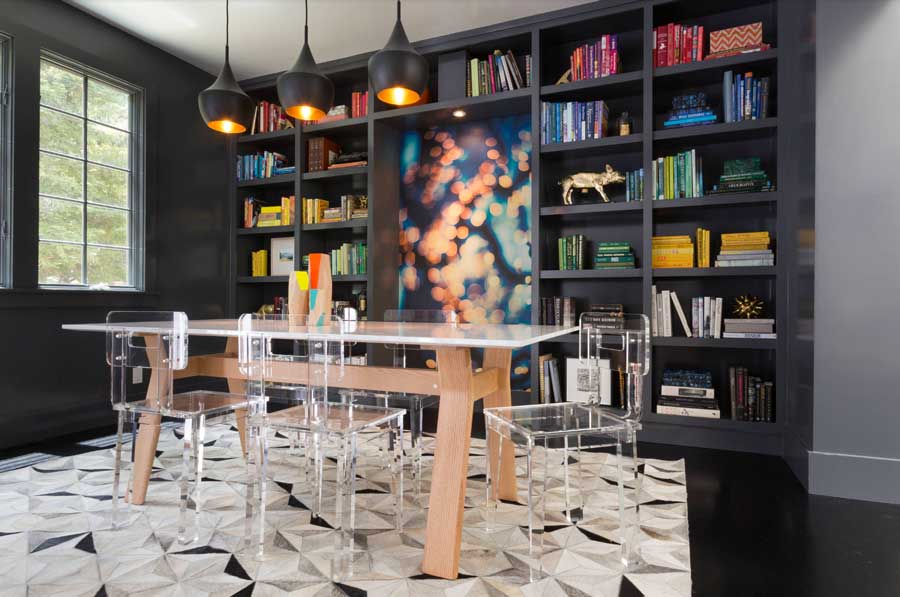
Dining Room
“Be bold,” is what this dining room says. The black built ins and contrasting geometrical neutral accents speak volumes. The primary colors jump from the walls but are met with the greens after to tie it all together. This palette is about expressing yourself and the dining room is typically understated, so change that!
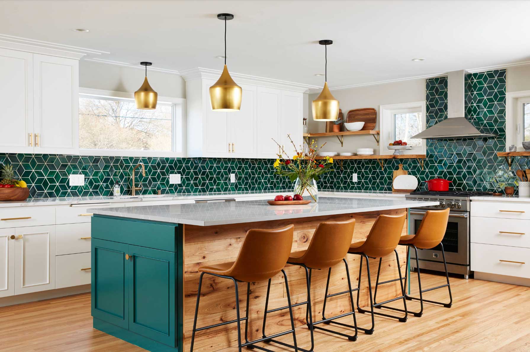
Kitchen
Clean, white kitchens will always be in style. But, amplify the space with color in the kitchen. Alexandrite, one of this year’s colors, is an amazing and dramatic color way to add some pop.
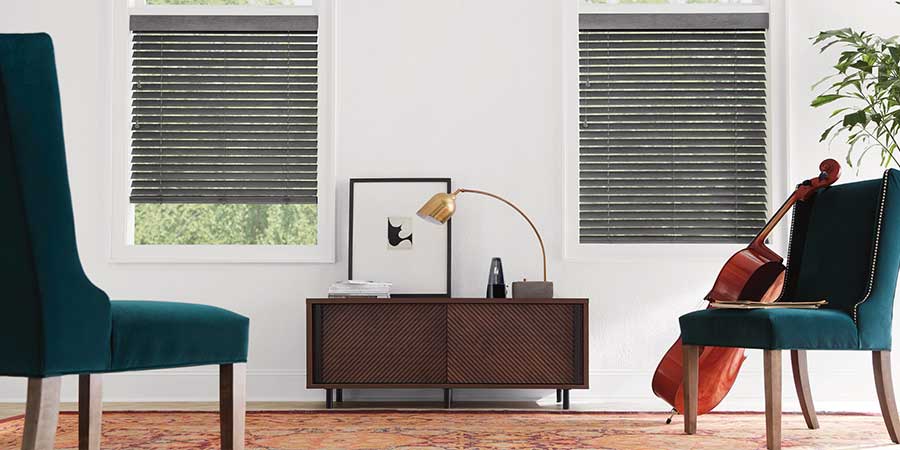
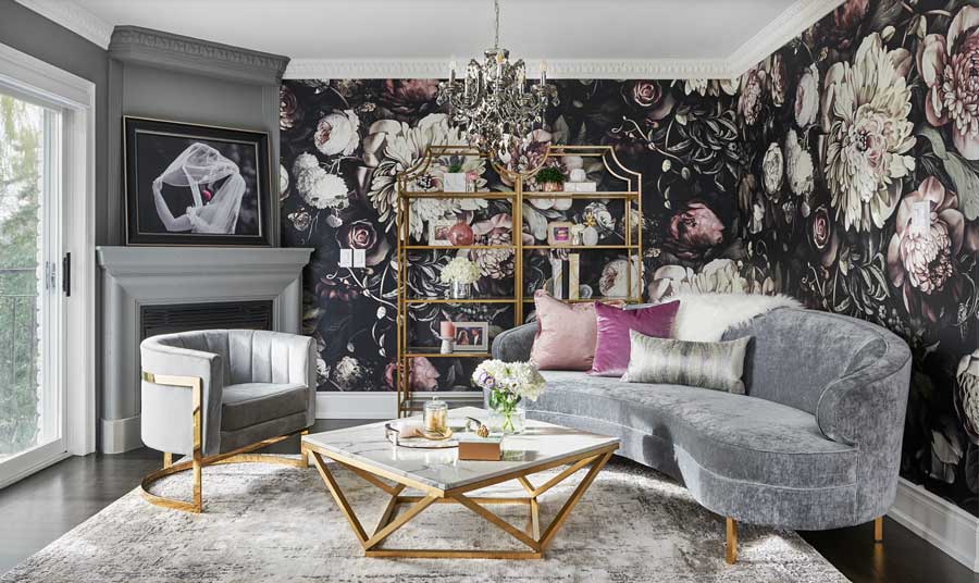
Living Room
This space in your home sees a lot of movement. It’s can be used for relaxing, meeting, and so much more. Treat it with some romance with the palette’s passionate hues. Red, pinks, and purples are the leading roles. What are some must haves for your living room design?
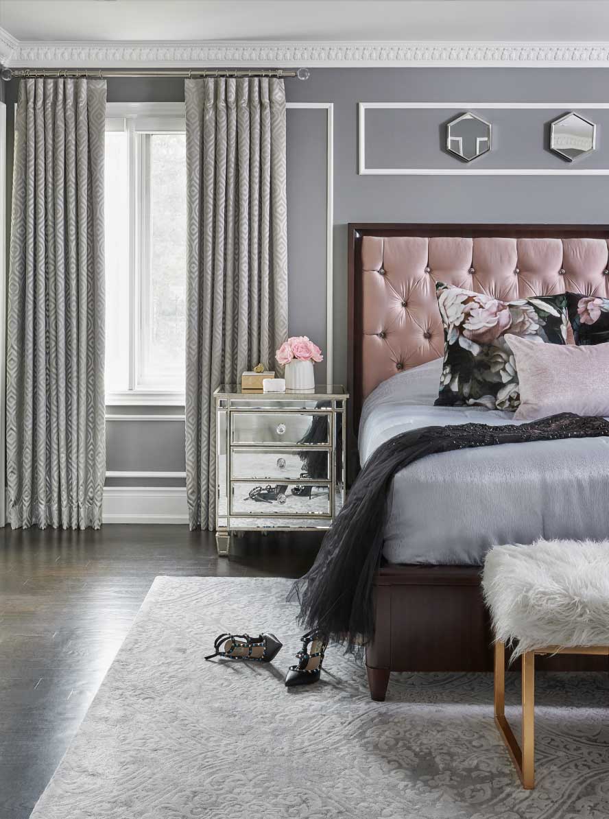
Bedroom
Keeping your master bedroom calm and serene is always great for a good night’s sleep. But, what if we added just a warmth of an accent, like this dusty rose. By adding it to the upholstery and pillows it becomes a dreamy bedroom design without being too much.
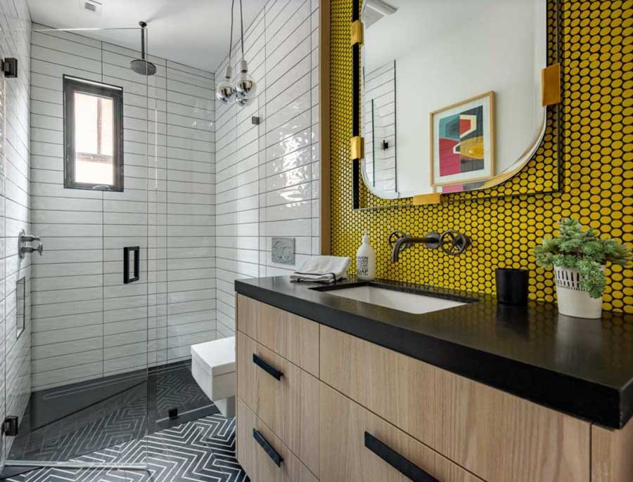
Bathroom
The nice thing about styling bathrooms is they can stand on their own design. There is no need to be cohesive with other areas. A splash of color goes a long way. Add some fun geometrics and every morning you have a fun and exciting space!
Which Colors Caught Your Eye?
Surround yourself with colors you love and your home and self will be more joyous. This year’s palette is pure color inspiration. Which shades sparked your creativity? At Rocky Mountain Shades, Shutters & Closets, we bring style, color, and solutions together. Contact us to schedule a free in-home consultation with our design experts today!