
The association with the ocean has always carried the vibe of peacefulness, calm and serenity. When telling a story of blue with your home, it’s good to remember that shades of blue are always on trend. One member of the blue color family easily plays a part in decorating continually over time. As an accent, or a backdrop, we love how blue is helping define the style of the spectacular spaces…from the expected to the unexpected, this shade’s popularity endures.
Welcome Home
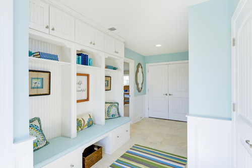
Your entryway sets the tone of your home. We love the light, airy nature of this entryway with blue walls that carry over into the accents of the custom built-in seating. Telling a story of blue, the keepsakes and accent pieces on the shelving vary in shades of blue for visual interest and nostalgia. Not to mention, we love when a space is both stylish and functional.
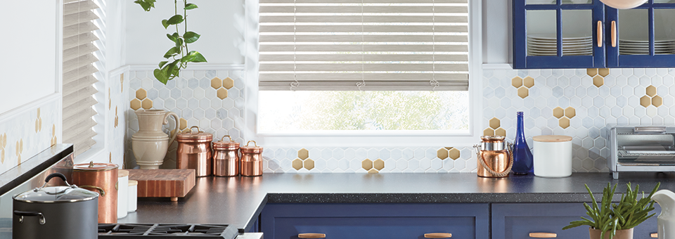
Modern Blue for the Kitchen
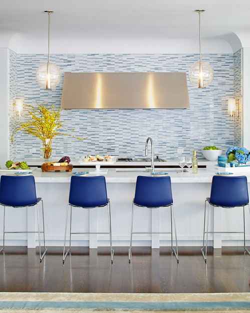
This kitchen shows us that the story of blue in decorating can be an accent or a permanent fixture. The tones of blue in the backsplash will be there for years, and because they’re soft, they’ll pair well with a number of colors over time. The chairs add instant modern appeal, brightening up the space with just the right amount of “wow.”
Dream of Springtime with the Right Shade
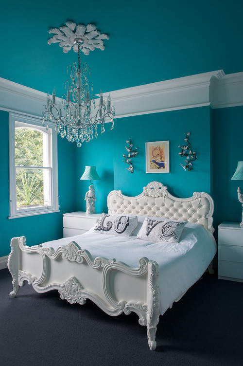
Blue is the perfect color for a bedroom. Soft and peaceful, it’s known as the color of calm. But knowing the range of shades, you can really set any tone–from bold to beautiful. This bedroom is full of fresh design. We love the way the bright turquoise contrasts with white furniture and accents. If we could do anything else? White shutters would frame these windows with gorgeous structure, while the benefits of privacy and room darkening would make this an ideal sanctuary of sleep and comfort. Dreaming about your own story of blue in the bedroom? Don’t forget the window treatments–they’ll be your favorite feature in the end!
Living Room Full of Life

Fun, fresh and full of style, this living room wears its story of blue with a balance of traditional (think cornflower) and light (oh, so soft). We love how the shades of blue add airy appeal to this living room, accented with natural wood tones and greenery placed around the room. When adding color to your design, bringing in neutral and natural elements will ground the space, keeping it from appearing ultra-modern. But, when creating your design, don’t forget the window treatments! Which ones would go well in this space? White pirouette shades would create a stunning view of the large windows, while allowing the view out to remain magnificent. And, they provide constant UV protection so your furniture, area rug, flooring and artwork look amazing over time.
Complementary Colors for a Calm Bathroom

One of our Denver area clients chose the complementary color palette of blues and greens to create a peaceful, relaxing space in this bathroom. This small amount of tile is just the right accent for the bathtub, and is easily accented with soft blues. Like many of the other photo favorites, white contrasts well, and for a bathroom, showcases the overall feeling of refreshing clean. For window treatments, they chose this white silhouette shade, blending in with the rest of the space. We love sheer shades that bring in filtered light, or close off the space for privacy.
Tranquil Home Office
The home office is becoming an important part of the home. As more and more people choose the work from home, smart and stylish design is necessary. Would you love this soft blue wall color in your home office? Serenity was chosen as color of the year 2016, and we can see why. Soft shades of blue are tranquil, and surrounding yourself with an atmosphere of calm seems like just the right setting for success. For window treatments, fabric shades are flowing and fit the emotion of the space, just be careful that the glare won’t overwhelm you. In that case, many clients choose window treatments with directional control so the right amount of light enters to meet their preferences.
Dining Room Delights from Floor to Ceiling

The “fifth wall” is one of the biggest trends in home design this year. Painting your ceiling adds an uber chic look. Using the same color as the walls, or as an accent color, is a trend we just can’t get enough of. This stunning dining room is elegant, and really shows off the character of the home. There’s one thing to be aware of when painting the ceiling. The room may seem darker, as a white ceiling tends to brighten the space. With these draperies, glaring sunshine is seen at the window and at eye level, but doesn’t enter the room to brighten it. We suggest top down shades, especially for a space like this, allowing you fresh daylighting across the ceiling, but reducing frustrating, and sometimes blinding, glare at eye level.
Ready to Tell Your Story of Blue?
How will you tell your story of blue? Which shade is your favorite? We’d love to know! Our design experts at Rocky Mountain Shutters & Shades would love to help you complement your space, and create the perfect atmosphere in your Denver area home. The right window treatments will accent your design, give you ideal light control, privacy and UV protection, along with a host of other solutions! Contact our team for a FREE in-home consultation today!