
Colors shift as time moves forward. You can see how these colors influence many different areas of life, including home decor. As the Pantone Palette 2023 was released, the Color Institute showcases how this mix of 10 main colors and five core classics reflect the latest trends.
Introducing the Colors…
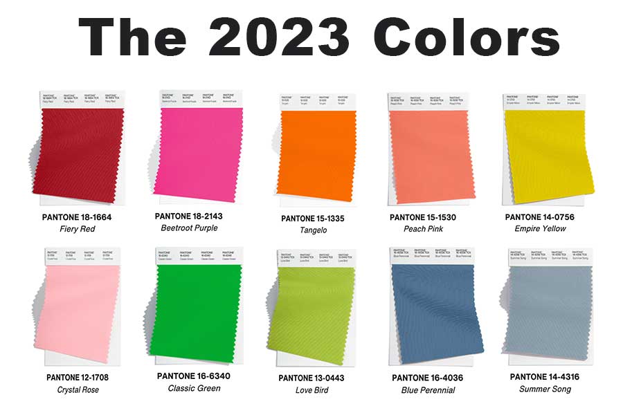
The vibrant mix seen in the main 10 colors of 2023 is not intended to be looked at in a singular space. Some hues are seen through furniture, wall paint or accent pieces. These bold colors encourage expression!
Announcing the Core Classics…

While the 10 main colors are vibrant, bold and eye-catching, the five core classics are softer hues that highlight how neutrals have evolved. They have a calming, quiet presence but still stand out in a home.
Colors in Home Decor
As these colors were originally viewed in New York’s Fashion Week, it does not mean that they are not already present in home decor! Take a look at how these colors have made their way into interior design.
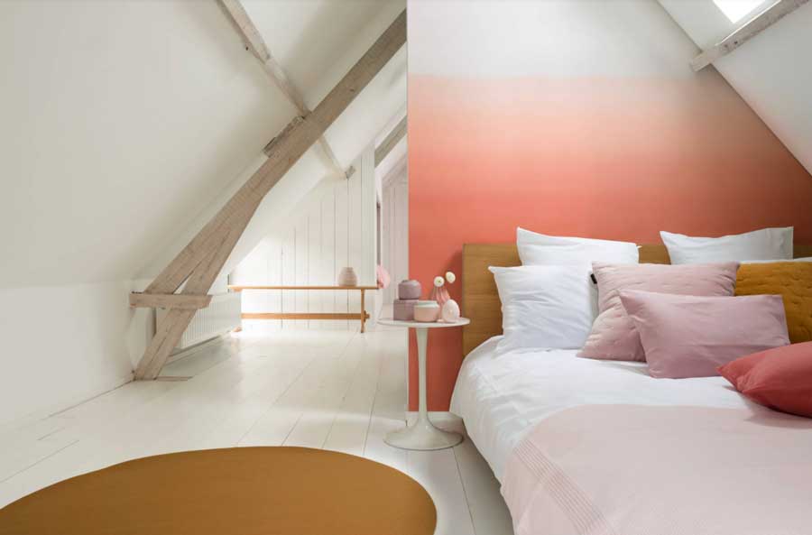
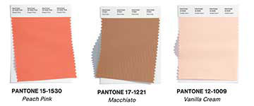
The Bedroom
The bedroom is meant for relaxing. Who says a calming space cannot have vibrant colors? Evidently, this space takes on a new shape by pairing one of the main colors with two core classics. This color mix is sure to be an inviting and calming space in any house.
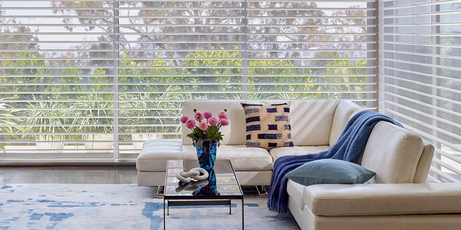
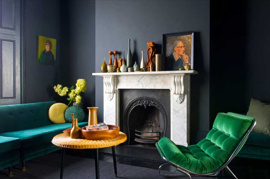
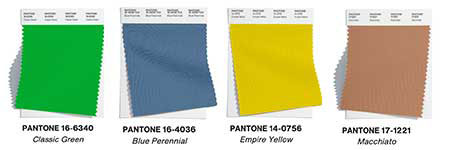
The Living Room
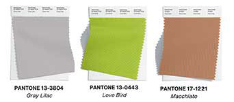
The 10 main colors provide an energetic feel to the room. Furthermore, they also provide a moody feel and appearance to a space. This living room pairs contrasting colors like blue perennial, classic green, love bird and macchiato. They complement each other without being overbearing. This makes it a great space to relax and spend time with others.
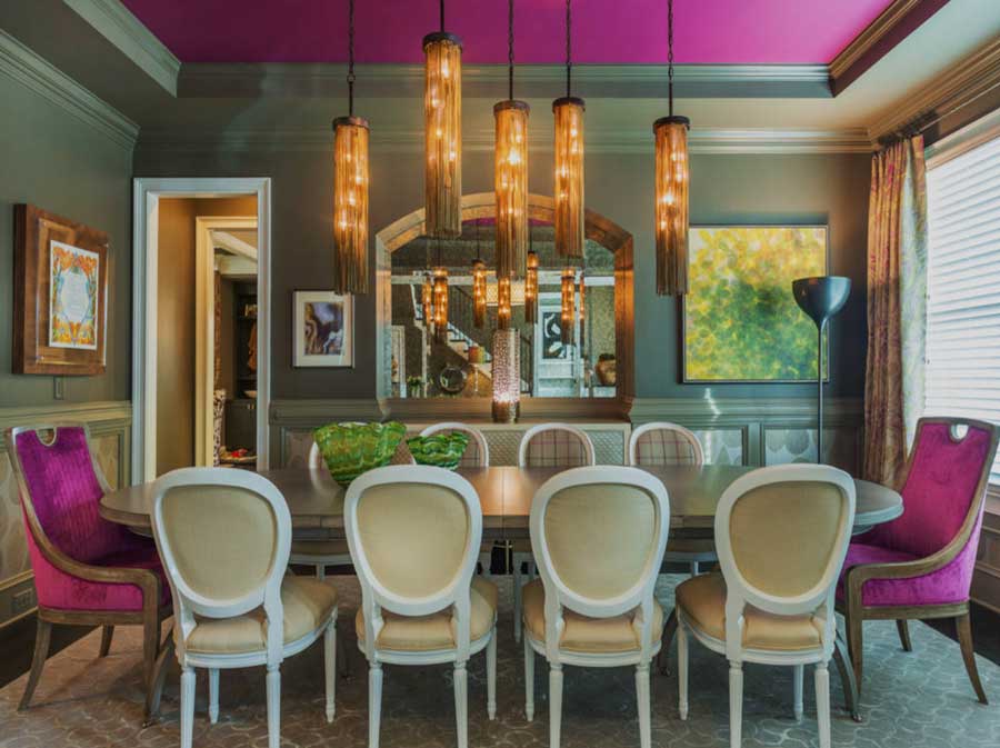
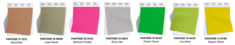
The Dining Room
Typically the first space you see when you enter a home, the dining room is the first topic of conversation. The vibrant beetroot purple hue on the ceiling paired with the softer leek green color on the walls is not a common choice. It makes this space the center of conversation as guests ask about your inspiration for the room.
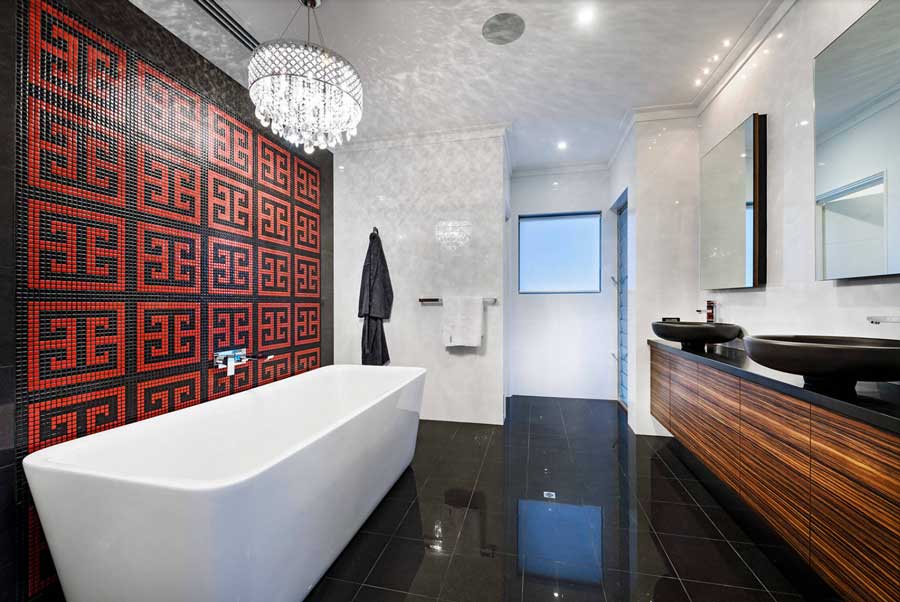
The Bathroom
Color appears in many different shapes and sizes when it comes to home decor. For instance, the fiery red is a perfect accent color in the tilework behind the standalone tub. While it catches the eye of those who see it, it also contrasts nicely with the more subtle hues present in the space.

The Kitchen
The kitchen gives direction to the house and is the hub for everything. As the usage of this space is always the same, it can take on a more exciting shape with the colors selected. The vibrant backsplash paired with softer gray cabinets ensures that there is always something to see and enjoy when your guests gather here for a meal.

What Are Your Favorite Colors?
The 2023 Pantone Palette has many colors to choose from. The joy and vibrant feeling of the 10 main colors or calm and quiet feeling of the five core classics can be explored in any space. Whichever color you decide to use, we are ready to help you pick out window treatments that will work perfectly with your space! Invite us to your home or stop by to see fabric swatches in person. Schedule a FREE home consultation, and we will bring sample books, photo inspiration and expert guidance. Contact our team at Rocky Mountain Shutter and Shades today!